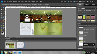
After having received my DigiPac feedback, I decided a few things needed to change and I needed to use other artist's digipac ideas more to develop my own. Firstly, my digipac looked like this:
but I decided there were a few things that weren't as professional as i'd like them to be. For example, the back cover had no particular layout. It was supposed to be in the style of vampire weekends "contra" but i hadn't directly copied it. Also, the "Run" writing didn't work with what I wanted. The front cover also seemed somewhat plain, so i added "Run" to the front cover too.
I then decided to look through some fonts and trial them against the digipac:
I most preferred the last one as it was more simplistic and suited the style of the digipac more on the whole. Also, on this digipac i removed the white boxing on the CD and i removed the black CD finger holes from over the person jumping's head. I also made the writing on the far right page on the bottom smaller. During the process of changing this, I also scanned Vampire Weekend's "contra" back cover into my computer and then placed it on my digipac:

I then laid my tracks over this to ensure my back cover was the exact same as theirs:
Which achieved the look i wanted. However, after looking at my digipac with the black font on the front cover, it seemed too bold for the antlers faded look, so i tried a light grey colour, which i think works well:
But then, i thought it may be a good idea to centralise the "run" and also try the "run" to the right side to see what it looks like:
But i have come to the conclusion that this is my favourite digipac so far:
as it targets the indie genre well, it is simplistic and it looks more professional than my previous ones.
I then went on to looking at my poster, because my fonts obviously were being experimented with. My originals looks like this:
I preferred the more simplistic approach to this poster and so I decided to go forward and remove the available dats etc. and the iTunes branding.
I then debated on the size of the antlers on the poster to try and use theories such as the rule of thirds. On the first picture is the larger set of antlers:
But i prefer them when they are smaller as, again, it gives the poster a more simplistic look.
Also, i changed my mind with the font and developed this idea:
but the run seemed a bit too large and over powering in comparison to the image, so i made it a bit smaller:
This is all my developing for now, however, i am going to ask my target market for their feedback on my digipac and poster and see what else may need changing to make the product more suitable.


Joe.
ReplyDeleteSorry for the delay. In terms of the digipak I'd favour no font on cover, remaining 3 green panels are lovely and work a treat. The other three panel I'm going to be annoying about. The left hand panel (as you would look if it were the correct way up) might benefit from some left alligned white font thanking folks for making the album or some such other stuff. I may well be wrong though Joe but it'd be worth messing about with it. I'd then leave the CD panel devoid of any text what so ever but add in a spine upon which you can write Skeleton Boys Run and a made up catalogue code.