


Showing posts with label Album Covers. Show all posts
Showing posts with label Album Covers. Show all posts
Thursday, 10 November 2011

Monday, 7 November 2011
Final Draft: Album Cover

This is my final draft of my album cover; I was given feedback to fill the whole circle of the person running as it creates the illusion that the black object is in the middle and he is running around it. I really like this finished version but will happily receive more feedback to improve it even further.
UPDATE: After receiving feedback as a comment on this post I have updated the image with the suggested alterations; I now like my creation even more and think the perspective adds so much to the picture.

Album Cover Draft: Edit


I have edited my original album cover slightly by changing the tone of the black object by making it more matte; I have also smudged the grass onto the box slightly so that it looks more 3-dimensional and looks as though it is actually set in the field rather than an image glued onto the original photo.
I have also created a back cover for my digipak; the design is very simple so that the cover keeps most of the attention however the information needed is written across the back cover in white contrasting writing.
Saturday, 5 November 2011
New Album Cover Draft Idea


These are my three ideas for an album cover; I took inspiration from a previous post about The Automatic - This Is A Fix CD cover. I have used the same image on each design but with slightly different features; the first two with no writing on at all would have the band name and album name written down the side of the CD case so it makes the image stand out a lot more. Although I have included a design with writing on the cover I am unsure as to whether I will use this feature or not.
The idea of the black object came from The Automatic's cover and I really like the idea, however I do not know if the location of the black box is right or not for this image - it could be smaller, further in the distance, or another shape entirely. I really like the images I have taken and joined together as it looked like 4 separate people running through one field however it is the same person with editing on Photoshop. I used my brother as the person for my draft, I could change this for the real one however he is a good person to use as he is neutral to the band and the media group in general so he has no purpose to the song; this idea came from both The Automatic's album but also a famous Arctic Monkeys album (Whatever People Say I Am, That's What I'm Not) featured a random man smoking on the front cover.
The idea of the black object came from The Automatic's cover and I really like the idea, however I do not know if the location of the black box is right or not for this image - it could be smaller, further in the distance, or another shape entirely. I really like the images I have taken and joined together as it looked like 4 separate people running through one field however it is the same person with editing on Photoshop. I used my brother as the person for my draft, I could change this for the real one however he is a good person to use as he is neutral to the band and the media group in general so he has no purpose to the song; this idea came from both The Automatic's album but also a famous Arctic Monkeys album (Whatever People Say I Am, That's What I'm Not) featured a random man smoking on the front cover.
Friday, 4 November 2011
Digipak Inspiration

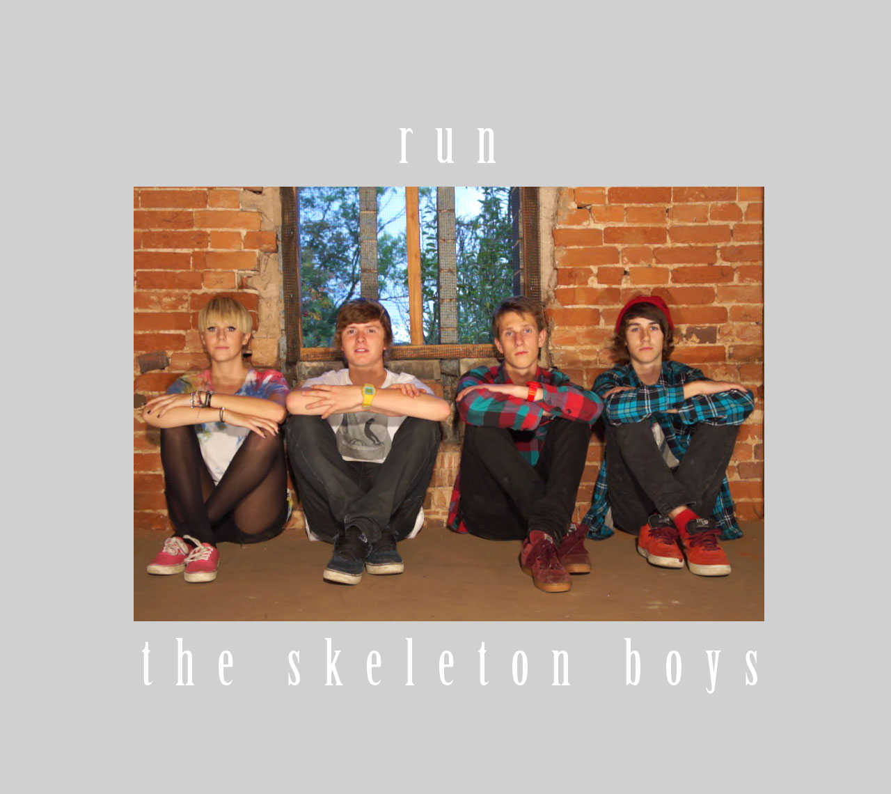
I have taken inspiration heavily from the album cover of The Automatic - This Is A Fix; this is because the band are an alternative/indie/rock band, not of a similar sound to mine but in the same genre style. There are also four band members in the band and none of them are shown on the cover, this is the type of CD cover that I have decided to go for - using the band on the cover for my first draft was too boring and not exciting enough for the fresh band, The Skeleton Boys.
This album cover is a take on a weird film with the theme of big black shapes that appear in random places, the inside of the digipak booklet features multiple locations with the large black object in various shapes around the photographs. This is a creepy album cover due to the black object but also the use of children on the front playing 'ring a ring a roses' makes it even more edgy and peculiar.
Wednesday, 2 November 2011
Decisions For Digipak
I need to make a quick decision on which idea I will use for my final digipak. It could either be option A- the four coloured skeletons, option B- the rain drops or option C- the single rain drop.
Option A-

Option B-

Option C-

To make a decision on which one I will use, I am going to ask my target audience there opinion and see which one they most prefer. This will be done in two different ways. The first one I will ask people in person and give them the images to look at, and to get results I will keep a tally. The second way is to use social networking. I will either upload them onto Twitter or Facebook and have people comment or 'like' which ever one they like best. By using two different methods means I can get more peoples opinions, and face to face allows people to go into more depth.
Option A-

Option B-

Option C-

To make a decision on which one I will use, I am going to ask my target audience there opinion and see which one they most prefer. This will be done in two different ways. The first one I will ask people in person and give them the images to look at, and to get results I will keep a tally. The second way is to use social networking. I will either upload them onto Twitter or Facebook and have people comment or 'like' which ever one they like best. By using two different methods means I can get more peoples opinions, and face to face allows people to go into more depth.
Saturday, 22 October 2011
New Ideas For My Digipak
I went away for the half term which meant I was unable to take part in filming, access the internet to post on the blog or social network to find out what was going on with the group. However, I did have access to a television and was able to keep working by watching music videos, and one stuck out to me. That video was Joe Goddard- Gabriel feat. Valentina. It got me really inspired to go in a completely different direction with my album cover.
As plain and boring as the video seems, I actually find the video really interesting to watch as a lot happens with such a simple idea. My favourite idea of the video is the rain drops, and how they vary in size and colour. This inspired me to create my own version for The Skeleton Boys digipak.
Here is Joe Goddard's cover for the single that carries on with the same idea from the video:

Finally, these are some of the ideas I have come up with after taking inspiration from Joe Goddard's music video. I'm still undecided on which design I like the most as I think I could do a bit more work with the rain drops and make them look a bit more authentic. I'm also still unsure on whether I like my first idea of the four coloured skeletons or this rain drop idea. To come up with a final decision I think I'm going to have to get opinions from my target market.


Tuesday, 11 October 2011
Ideas For Album Covers
I have created some ideas that I could use for The Skeleton Boys album cover. I used the image that drew and then scanned onto my laptop. I then opened this image and edited it on Photoshop, changing the colour of the lines. After Joe told me the size of an album cover was 140mm x 125 mm I could easily get cracking on with testing all sorts of ideas but sticking to a similar theme of drawn skeletons.


I also tested out images of the band to see which type of cover I would prefer to use- those are drawings and actual images of the band.


Album Cover Designs
I have created some draft designs for my album covers for The Skeleton Boys EP with the title, 'Run'. They have all been edited on Adobe Photoshop CS5; most of the covers feature the band members but a few do not. This is to show variation between the styles of album cover that I could look at create. I am unsure of the final measurements of the CD covers so the final design will be altered when I come to select it.
I will complete some of these album covers by adding in the rest of the digipak but before I do I was hoping to get feedback via comments on this post from my other group members / teachers.
Enjoy!
I will complete some of these album covers by adding in the rest of the digipak but before I do I was hoping to get feedback via comments on this post from my other group members / teachers.
Enjoy!




Storm Thorgerson
I created a SlideShare Powerpoint presentation about the artist, Storm Thorgerson, this was after being recommended to look at his work. I am pleased with what I found from his artwork as well as existing album covers, my inspiration is explained briefly in this short slideshow.
View more presentations from jessspardoe.
Thursday, 6 October 2011
Inspiration For An Album Cover

After researching skeleton related images, but being careful that they don't appear to gothic looking and giving the wrong impression that the band is dark and gloomy, I came across this image. I think I might use a similar idea to the image. Initially I will sketch out how I want it to look and I could have each member as a different coloured skeleton but to make it different to this I'd have them the same sizes they are and have a more cartoon effect than x-rays. My next task is to get drawing the skeletons!
Inspirational Album Covers
I have collected together 12 of my favourite album covers of the indie/alternative/rock genre. I have put them all together as an image to make it easier to see the contrasts and similarities between them all. I hope to use these all as inspiration for my draft versions but I wish to make my designs original and not copy any particular layouts or features of any existing products.
Click on the image to enlarge it for a clearer view.

Album Covers Moodboard

I decided to research various types of album covers of the genre. The most popular types I found were: cartoons/ images, band images and also text. I thinkmy favourite type would have to be text because they can look really effective.
Digipak Photoshop:
I have taken one existing album cover and developed it by using different effects within Adobe Photoshop Elements 5.0
Here is the original copy of the album cover, The Wombats - Modern Glitch:

I then used the 'Filter' tool within Photoshop to create many different effects of this image; some change simply the colour variations of the image, but some of them alter the entire effect, of these most turn out to be successful.
1.

2.

3.

4.

5.

6.

7.

8.

9.

The previous images show the 9 different effects I tried out, my favourites from this task are 5, 7 and 8.
I think number 5 with the embossed effect puts a whole new twist on the original image, with the main colour scheme being grey it appears duller but the visual effect of the indents and raised sections distracts the eye from the plain colour.
Numbers 7 and 8 are my favourites for similar reasons, the band name font is still readable in both images but the album name not so much - this would have to be altered if I used this effect on my final design. The images are still clear enough to see but the edit makes the cover look edgy and interesting rather than a plain photograph or drawing. The brightness of the sky in the image and the clothes that the models are wearing stand out a lot more in these edits as the colours merge together more; I really like these effects and I am considering using these on smaller sections of my work for example on the background but not any foreground images so that they are still clear to the eye.
Subscribe to:
Posts (Atom)