Photobucket
Showing posts with label Digipak. Show all posts

Monday, 14 November 2011

Final Digipak / Poster


Final Poster and Digipak

I am pleased with how my poster has turned out. I was really unsure with which one I wanted to go with originally, but decided this one because I think it looks more effective because of the strip going across the eye.


This is my final digipak which I am alsopleased with the way it turned out. However, I am worried it looks a little too plain, but I cannot change it now so I am happy with what I have.

Friday, 11 November 2011

Final DigiPac And Poster


Similarity Of Poster And Digipak Design

I have decided to keep my poster and digipak very similar. I am going to do this by using either the same or very similar images on both, using the same style font and the same colours. This not only shows continuity and professionlism but it also helps to promote the band. As I stated previously, by making the digipak and poster very similar, if the consumer sees a poster advertising the bands album and the digipak is similar to it, the consumer will know exactly what to look for when in the shop.

Examples of where it has worked well and there is a clear link between the two:

Florence and the Machine- Lungs


The XX- XX


Ellie Goulding- Lights


Thursday, 10 November 2011

Final Digipak Design:


Finalising a design:


1) I have a dilemma of the lounge location panel for my digipak; I am unsure whether to have the black object on the floor, fireplace or coffee table. I would like to get feedback about this from my group, peers or teachers before I post my final idea.

2) I have a second choice to make between these two central panels for my digipak, it will be the first page you see when you open the booklet up...


Wednesday, 9 November 2011

Poster Developments

For my poster, i wanted to achieve a simple look, such as Vampire Weekend:

or The XX:

In order to do this, I used the image from my front cover on the digipak and simply wrote the name of the band and the name of the album:


However, after looking at it, the writing seemed to be too big and taking the attention away from the image, and as a main focus point on both the digipac and the poster, I wanted to keep the attention on the image. So i made the writing smaller:


After discussing with my target market group, we decided that i should remove the album name, "run", as this would be more simplistic and the album should be easy to recognise due to the artistic image. This is the poster i came up with:


This font i have used throughout these posters is the same font used as in my digipac to keep the continuity. I like how the small writing does not draw your eye away from the image too much but i wondered whether it was maybe too small so i tried the writing a tad larger:


But after asking my target market group, they though that the smaller writing was the more suitable and more typical of the genre, and i agree with this. So this is my favoured poster:


Monday, 7 November 2011

Final Draft: Album Cover


This is my final draft of my album cover; I was given feedback to fill the whole circle of the person running as it creates the illusion that the black object is in the middle and he is running around it. I really like this finished version but will happily receive more feedback to improve it even further.

UPDATE: After receiving feedback as a comment on this post I have updated the image with the suggested alterations; I now like my creation even more and think the perspective adds so much to the picture. 


Decisions On Album Cover

Now that I have all my possible album covers, I asked 40 people from my target audience which one they preferred, followed by a comment about what they liked and disliked about any.  I found this really useful because it helped me decided on what I needed to improve on, and overall which idea I should go with. This winning cover which got the most likes was option D. This is the half painted skeleton face on a model- I am pleased with the results because this was my favourite cover.
Questionnaire for Cover

Images For My Digipak And Poster

At the weekend I took some pictures of my friend for my digipak using Harry's camera. I painted half her face in black and white face paint so it looked like half a skull. It took a long time but it was worth it! I'm really pleased with the outcome of the images and I'm pretty sure this is the idea I am going to use.

Here are some images of me putting on the face painted followed by some of the photos taken:


Further Development Of DigiPac After Feedback

This is the feedback sheet i received regarding my designs for my digipac:

On my digipac i decided to remove all writing on front cover and on the inside of the pack. This helped to achieve the simplistic look whilst still being quirky. I also added a spine to the CD case and gave the digipac a catelogue code.


I'm very happy with this design, but i thought it may look better with a "thank you" list, as most CDs do, so i tried this:


I then changed the placing of the "thank you" writing to further up the wall to see which looks best.


and then thought that maybe if i filled the whole wall with a "thank you" message it could look better:


These are my further developments for the time being.

Album Cover Draft: Edit


I have edited my original album cover slightly by changing the tone of the black object by making it more matte; I have also smudged the grass onto the box slightly so that it looks more 3-dimensional and looks as though it is actually set in the field rather than an image glued onto the original photo.
I have also created a back cover for my digipak; the design is very simple so that the cover keeps most of the attention however the information needed is written across the back cover in white contrasting writing.

Saturday, 5 November 2011

New Album Cover Draft Idea


These are my three ideas for an album cover; I took inspiration from a previous post about The Automatic - This Is A Fix CD cover. I have used the same image on each design but with slightly different features; the first two with no writing on at all would have the band name and album name written down the side of the CD case so it makes the image stand out a lot more. Although I have included a design with writing on the cover I am unsure as to whether I will use this feature or not.
The idea of the black object came from The Automatic's cover and I really like the idea, however I do not know if the location of the black box is right or not for this image - it could be smaller, further in the distance, or another shape entirely. I really like the images I have taken and joined together as it looked like 4 separate people running through one field however it is the same person with editing on Photoshop. I used my brother as the person for my draft, I could change this for the real one however he is a good person to use as he is neutral to the band and the media group in general so he has no purpose to the song; this idea came from both The Automatic's album but also a famous Arctic Monkeys album (Whatever People Say I Am, That's What I'm Not) featured a random man smoking on the front cover.

Friday, 4 November 2011

Digipak Inspiration


I have taken inspiration heavily from the album cover of The Automatic - This Is A Fix; this is because the band are an alternative/indie/rock band, not of a similar sound to mine but in the same genre style. There are also four band members in the band and none of them are shown on the cover, this is the type of CD cover that I have decided to go for - using the band on the cover for my first draft was too boring and not exciting enough for the fresh band, The Skeleton Boys.
This album cover is a take on a weird film with the theme of big black shapes that appear in random places, the inside of the digipak booklet features multiple locations with the large black object in various shapes around the photographs. This is a creepy album cover due to the black object but also the use of children on the front playing 'ring a ring a roses' makes it even more edgy and peculiar. 

Thursday, 3 November 2011

Feedback: Digipak and Poster

My feedback sheet given was as expected; I did not like my digipak at all and completely regretted my idea choice as soon as I had completed it, I was expecting the worse in a sense as I was hoping that my teachers would not like it either. I will change my ideas completely and start from scratch taking inspiration heavily from another band's existing digipak.

I was marked a 2/10 for my digipak due to:
Digipak lacks cohesion, the cover is ok but the rest just doesn't work. The burgundy isn't very indie and the window whilst a bit Magritte isn't Magritte. The back cover doesn't need HMV and Apple, it does need legal jargon though. The band sitting down is boring and just seems like a filter and the three panels spanned by 'The Skeleton Boys' seems like a kids party CD.
Following this I was marked another 2/10 for:
Poster. Better, still that horrid colour though. This could work but needs to be more striking and strong (Meg's works because she's ripped off The XX), I'm not sure lower case works. Kerrang and the Telegraph aren't appropriate reviews. I don't think the shadow font is right either.

- I completely agree with the feedback I received and am more than happy to start over again; I did not like my design at the time after I had created it but I decided to receive feedback on it anyway to find out how to improve my general ideas as I could not quite bring it to life.
However I have now been set on track with an idea, and will create a second draft to present to my teachers before finalising my design.


Another Idea For A Digipak

I've had yet another idea for my digipak, and this will be my last because I really need to make some final decisions. My 4th and final idea is is to recreate this image with a model I have already chosen, and use it as the front cover:

I then want to continue with this idea inside the digipak and on the poster. I am going to take some photographs this weekend to see whether I like the idea and then get some feedback on it from my peers, teacher and target audience.

Wednesday, 2 November 2011

Decisions For Digipak

I need to make a quick decision on which idea I will use for my final digipak. It could either be option A- the four coloured skeletons, option B- the rain drops or option C- the single rain drop.

Option A-


Option B-


Option C-


To make a decision on which one I will use, I am going to ask my target audience there opinion and see which one they most prefer. This will be done in two different ways. The first one I will ask people in person and give them the images to look at, and to get results I will keep a tally. The second way is to use social networking. I will either upload them onto Twitter or Facebook and have people comment or 'like' which ever one they like best. By using two different methods means I can get more peoples opinions, and face to face allows people to go into more depth.

Saturday, 29 October 2011

DigiPac Developing

After having received my DigiPac feedback, I decided a few things needed to change and I needed to use other artist's digipac ideas more to develop my own. Firstly, my digipac looked like this:

but I decided there were a few things that weren't as professional as i'd like them to be. For example, the back cover had no particular layout. It was supposed to be in the style of vampire weekends "contra" but i hadn't directly copied it. Also, the "Run" writing didn't work with what I wanted. The front cover also seemed somewhat plain, so i added "Run" to the front cover too.


I then decided to look through some fonts and trial them against the digipac:


I most preferred the last one as it was more simplistic and suited the style of the digipac more on the whole. Also, on this digipac i removed the white boxing on the CD and i removed the black CD finger holes from over the person jumping's head. I also made the writing on the far right page on the bottom smaller. During the process of changing this, I also scanned Vampire Weekend's "contra" back cover into my computer and then placed it on my digipac:
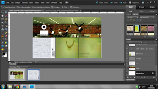


I then laid my tracks over this to ensure my back cover was the exact same as theirs:


Which achieved the look i wanted. However, after looking at my digipac with the black font on the front cover, it seemed too bold for the antlers faded look, so i tried a light grey colour, which i think works well:


But then, i thought it may be a good idea to centralise the "run" and also try the "run" to the right side to see what it looks like:


But i have come to the conclusion that this is my favourite digipac so far:


as it targets the indie genre well, it is simplistic and it looks more professional than my previous ones.

I then went on to looking at my poster, because my fonts obviously were being experimented with. My originals looks like this:


I preferred the more simplistic approach to this poster and so I decided to go forward and remove the available dats etc. and the iTunes branding.
I then debated on the size of the antlers on the poster to try and use theories such as the rule of thirds. On the first picture is the larger set of antlers:


But i prefer them when they are smaller as, again, it gives the poster a more simplistic look.
Also, i changed my mind with the font and developed this idea:


 but the run seemed a bit too large and over powering in comparison to the image, so i made it a bit smaller:


This is all my developing for now, however, i am going to ask my target market for their feedback on my digipac and poster and see what else may need changing to make the product more suitable.